Shaping a brand identity for a crypto community
Built a modular brand identity to help AXT grow from stealth to full-scale launch, consistent, confident and ready to scale.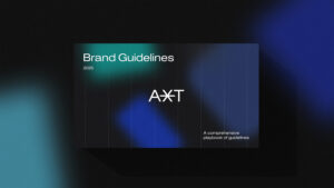
When AXT, a fast-growing community built around the Axioma Token (AXT), decided to launch its official hub, they needed more than just a logo. They required a complete brand identity system: one that could support a wide range of themes, from financial growth to well-being and personal development, while distancing itself from the overused aesthetics of Web3 and crypto.
There was no visual foundation in place. I led the project end-to-end, from early discovery to design execution and delivery taking full ownership of the brand strategy and creative direction and ensuring clarity, consistency and long-term flexibility.
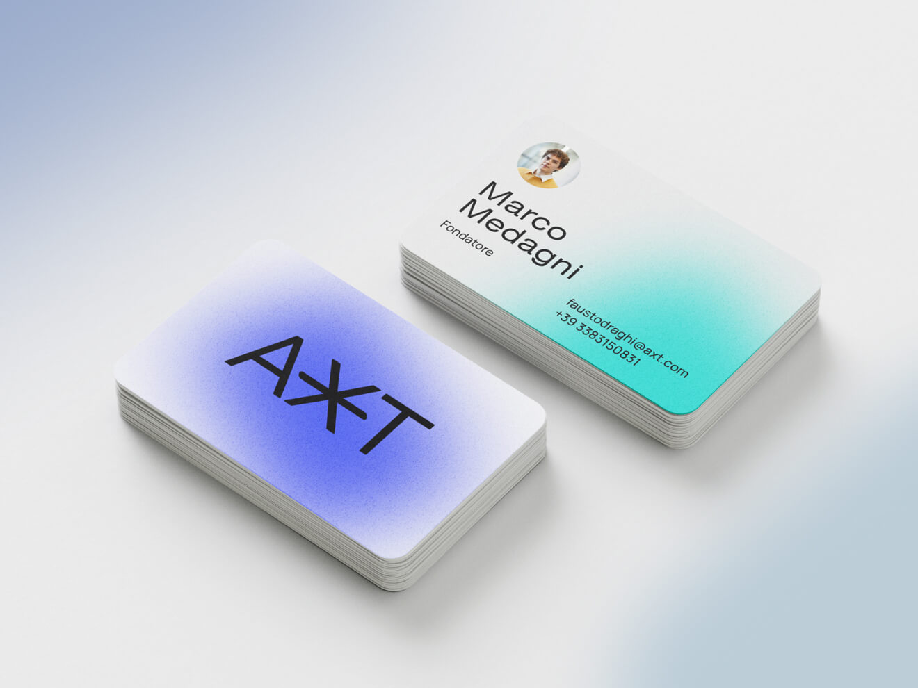
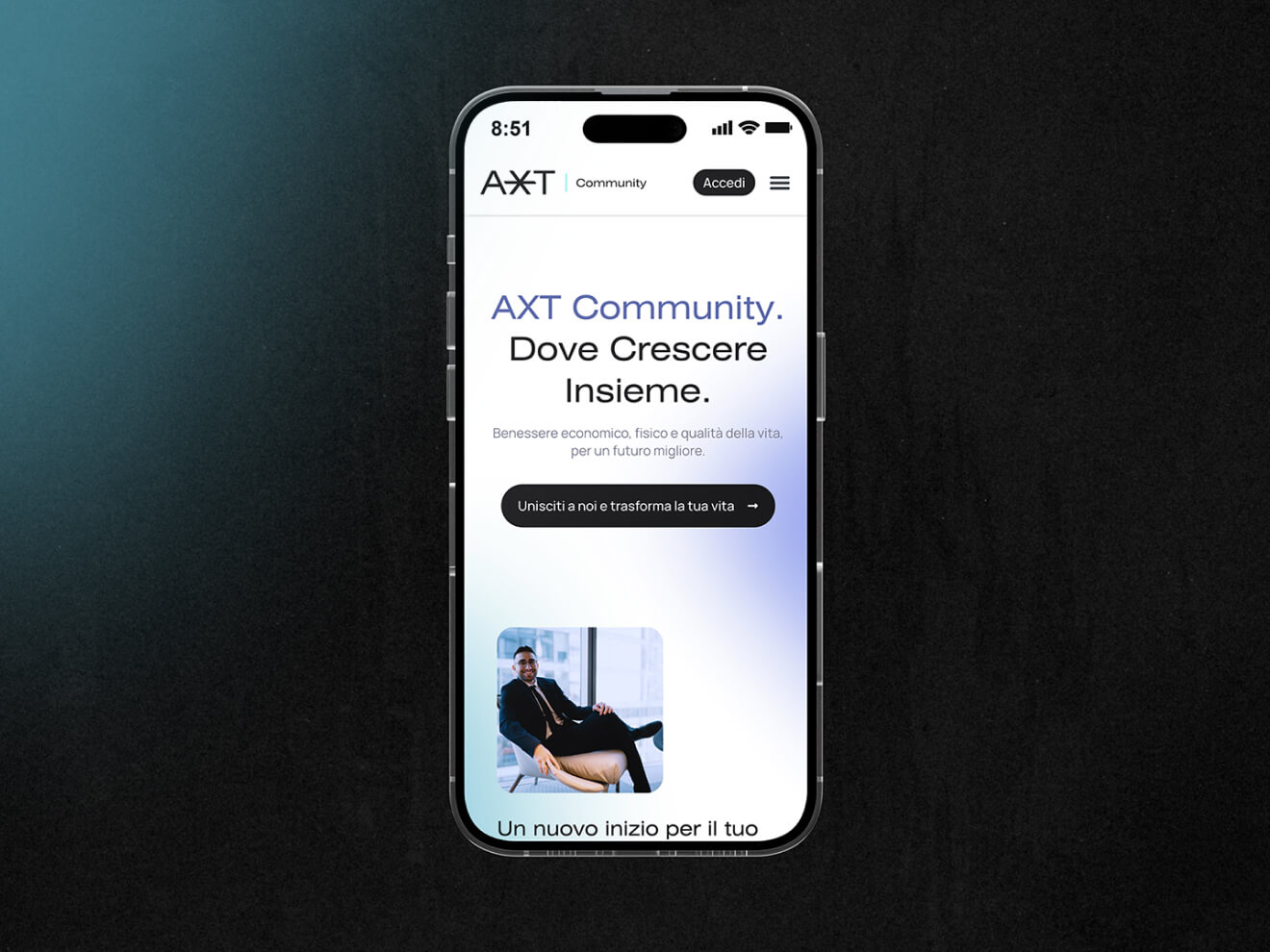
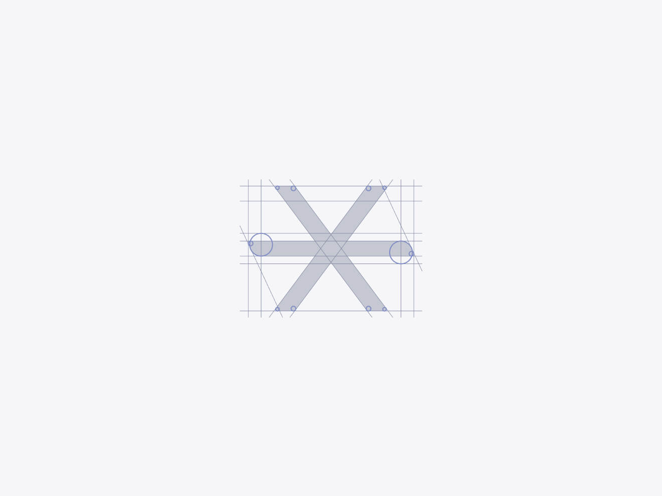
I have built the AXT logo from scratch using a geometric construction grid that ensures consistency and harmony across formats. It’s designed to function with or without taglines supporting multiple brand extensions like “AXT community”, “AXT essential” or “AXT travel”.
At its core lies a distinctive “X”, both a literal reference to the token and a visual anchor for future brand storytelling. Subtly embedded within the structure, it was also imagined as a motion-ready element, hinting at dynamism and expansion. While animation wasn’t included in the final scope, the brand’s motion potential is built into the design language.
This logo wasn’t just made to look good but it was built to scale.
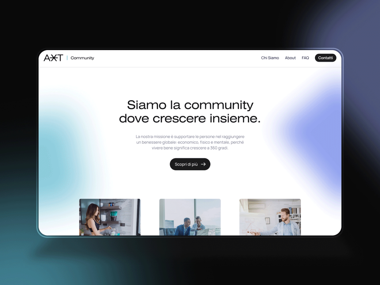
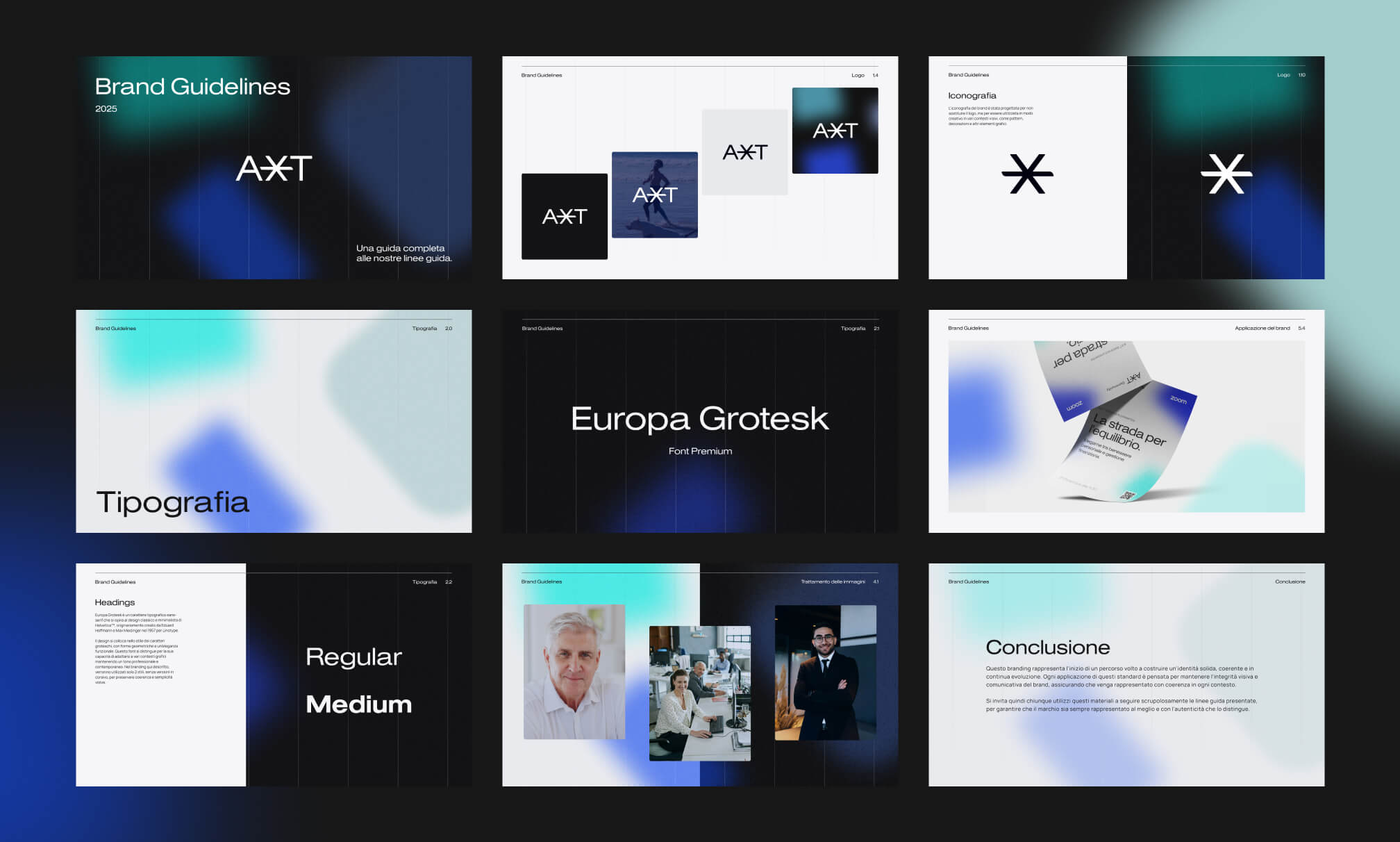
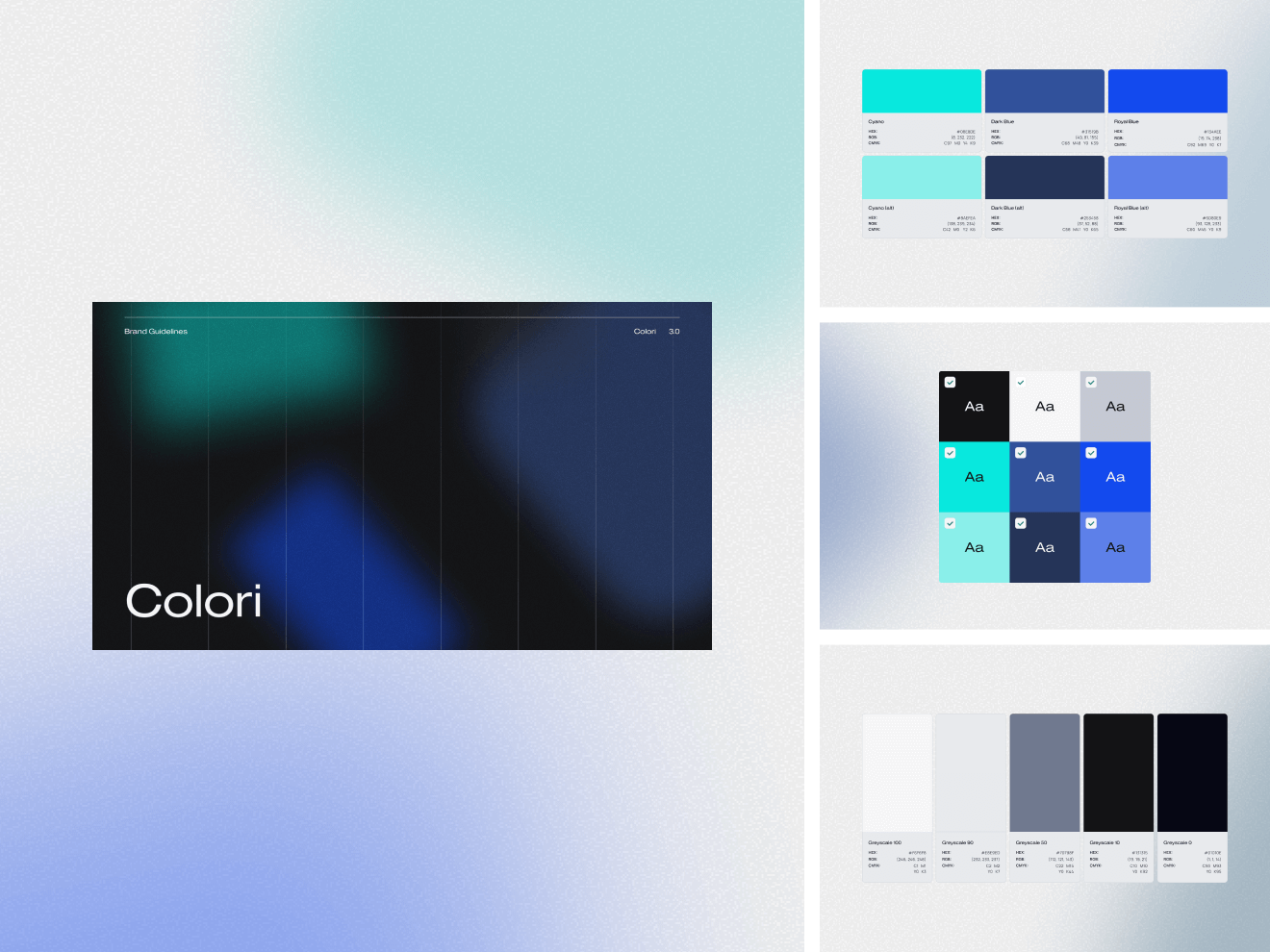
The colour palette avoids the generic “premium” look often found in fintech or Web3. Instead, I introduced layered blues and cyans with soft gradients, noise textures, and strong contrast, creating a system that feels both professional and expressive.
From a branding psychology perspective, blue evokes trust and composure, while lighter tones introduce a sense of clarity, agility and accessibility, all critical for a community-centred platform.
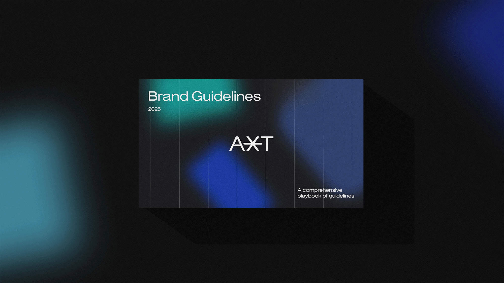
For typography, I paired the premium sans-serif Europa Grotesk for headings with Manrope for body content, a high-performing Google font optimised for digital use.
This pairing supports visual hierarchy, readability, and responsive brand design, ensuring the system works seamlessly across print and digital interfaces.
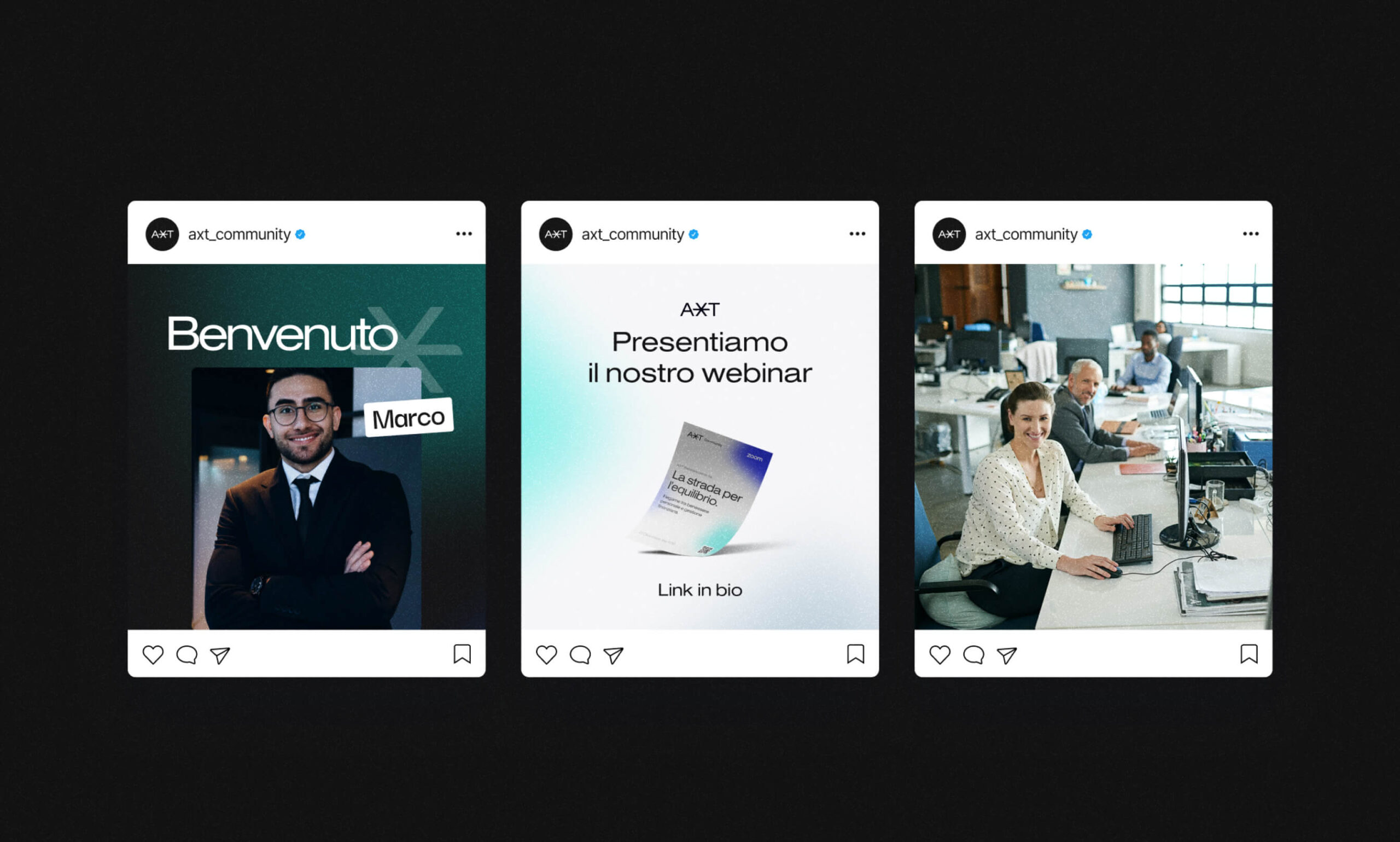
The deliverables went far beyond aesthetics. I created a modular brand system designed to evolve with AXT’s mission.
- Included in the final package:
- Logo files (horizontal/vertical, with and without tagline)
- Structured grid system and spacing rules
- A clean icon set in multiple formats (SVG, PNG, Figma)
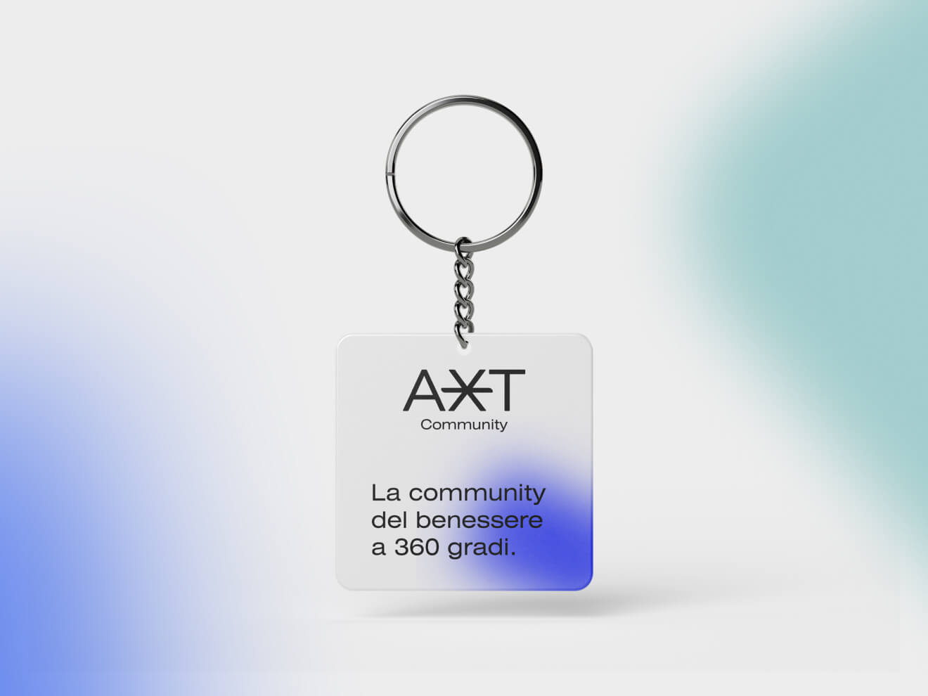
- Noise-treated backgrounds and creative assets for digital use
- Font pairing and typography usage guidance
- Applications tested across social media, presentations, and marketing material
- Full brand guidelines documentation, including usage do’s/don’ts and accessibility best practices
To ensure long-term usability, I also provided technical onboarding support: from font installation to device rendering checks and fallback suggestions.
AXT isn’t just a token but also a platform for growth: economic, physical, and personal. And to support that evolution, the brand needed more than style. It needed structure.
What I focused on delivering is a system that combines creative direction, UX-conscious design and strategic branding, everything built for consistency today and adaptability tomorrow.
Every detail, from the typography scale to the grid behind the logo, reflects the belief that design is not decoration, but decision-making.
Crediti
| Cliente | AXT Community |
|---|---|
| Creative Direction, Brand Design, Delivery | Matteo Miele (Studio Miele) |