Reshaping a brand identity from the ground up
We rebuilt the brand from scratch, creating a cohesive identity system that made scaling easier for every team.
Wiredmark is a London-based creative performance agency specialising in brand strategy, content production, and digital advertising and needed a visual identity system that could support both creative and performance marketing outputs. In just a few years, they had evolved from a founder-led consultancy into a fast-growing digital agency, requiring a complete brand identity redesign to match their new scale serving international clients across sectors like tech, lifestyle, and finance.
With this rapid growth came a new challenge: their brand identity no longer reflected the scale, positioning, or creative maturity of the agency. They needed a complete rebrand—from strategic foundations to visual identity and digital touchpoints—that could support their next phase of expansion.
I was tasked with leading the project as creative director, working closely with another designer and their internal copywriter to shape a new brand from the ground up—one that could capture who Wiredmark had become, and make space for where they were heading.


This was a full-scale rebranding for a digital agency—spanning strategy, creative direction, and the design of a full visual identity system—all from a blank slate. The only thing we kept was the name.
Wiredmark is a creative agency, so we made sure the process was collaborative—but always guided by a clear creative direction.
The brand positioning we proposed, “Bridge the Gap”, distilled their mission into a single, strategic idea: helping brands close the space between creative ambition and measurable results. It also captured how Wiredmark operates—between performance and brand, logic and imagination.
Visually, the concept took shape in a custom wordmark where the gap between letters subtly expands across the name, symbolising business growth and creative momentum.
Around this core, we designed a full visual system:
- Icons tailored for digital environments
- Image treatment guidelines to ensure brand consistency across content
- A flexible, vibrant gradient palette
- A modern typeface that balances clarity with personality
These components formed a modular design system, built to scale across platforms and empower Wiredmark’s internal marketing team.
The internal copywriter defined a distinct tone of voice—sharp, confident, and direct—that completed the identity and ensured coherence across web, decks, and social media.


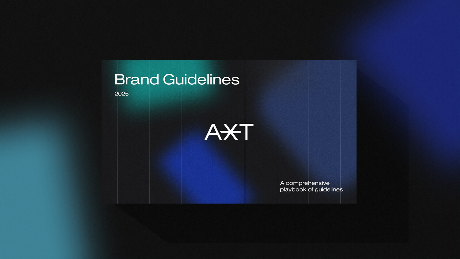
Once the new identity was defined, we compiled all components—visual, verbal, and strategic—into a comprehensive brand book, designed for both print and digital use.
The clarity and momentum of the rebrand led to a new request: a complete redesign of Wiredmark’s website—combining UX/UI design, motion direction, and SEO-friendly web architecture. I took full ownership of the entire site, from structure to copy. For this I defined structure, design, motion direction, and copy—delivering it in under a month. The new site also included a fully accessible, online version of the brand guidelines.
From there, I translated the identity into a full set of social media assets, ensuring visual and tonal coherence across all platforms. Every element—from icons to gradients—was calibrated for both clarity and reach.
By grounding the digital experience in SEO-conscious UX principles and scalable design patterns, the new identity wasn’t just built to look good—it was built to perform.
The site was optimised for discoverability and performance, aligning visual storytelling with digital marketing best practices. The full digital brand rollout was implemented across web and social, reinforcing the brand's new positioning with clarity and consistency.


Credits
| Client | Wiredmark – Creative Performance Agency (UK) |
|---|---|
| Creative direction & lead design | Matteo Miele (Studio Miele) |
| Brand strategy & visual identity | Matteo Miele & Riccardo Curin |
| Motion | Matteo Miele & Riccardo Curin |
| UX/UI design | Matteo Miele |
| Copywriting | Mario Palmieri |