Creating a brand that makes green energy simple and accessible
From user interviews to archetypes, we built a brand from scratch translating insights into a clear identity, an intuitive product and a scalable design system.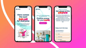

Brief & Challenge: Making Green Energy Accessible
The context
Renewable energy often feels distant, complex, and unaffordable. SMS Energy wanted to change that with Metis: an energy-as-a-service platform offering fully funded solar panels and batteries with no upfront cost, paid through a flat monthly subscription.
The Challenge
The goal was to create a brand and digital product that could make clean energy simple, trustworthy, and desirable—removing financial and emotional barriers for both landlords and households.
My Role
As Senior Product Designer at CI&T, I collaborated with a lead designer and an illustrator. I was responsible for building the brand’s modular visual system, ensuring accessibility across all touchpoints, and designing the product UI—including the high-impact savings calculator.


02
Research & Insights: Understanding User Needs
The process
Over several months we conducted:
-
Dozens of in-depth interviews with landlords, tenants, and homeowners.
-
Behavioural pattern analysis using Loop, an AI-powered tool that surfaced recurring needs and pain points.
-
Competitive benchmarking of green energy services, to identify industry gaps and user frustrations.
Key insights
-
Clarity gap — Users struggled to understand costs, timelines, and technical requirements, which led to hesitation.
-
Motivational gap — Even when affordable, renewable energy felt “distant” and uninspiring.
Personas & journey mapping
We created personas around two main groups: landlords prioritising ROI and reliability, and tenants seeking transparency and ease. Their journeys highlighted critical decision moments and drop-off risks.
Strategic synthesis
The brand needed to balance two forces:
-
Reassurance — rational, transparent communication to remove fear of complexity.
-
Inspiration — a positive, empowering narrative that made renewable energy feel attainable.
Brand Archetypes
This balance was captured through two guiding brand archetypes:
-
The Sage — wisdom, knowledge, trust.
-
The Magician — transformation, creativity, possibility.

03
Brand Strategy & Visual Identity: From Archetypes to System
Exploring directions
We developed two creative routes, one rooted in the Sage and the other in the Magician. By comparing extremes, we validated expressive potential and found the right balance between clarity and imagination.
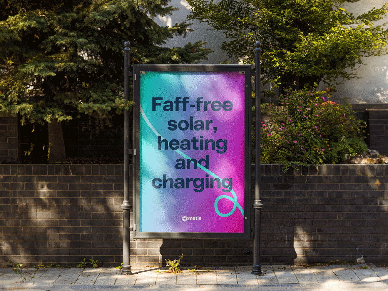
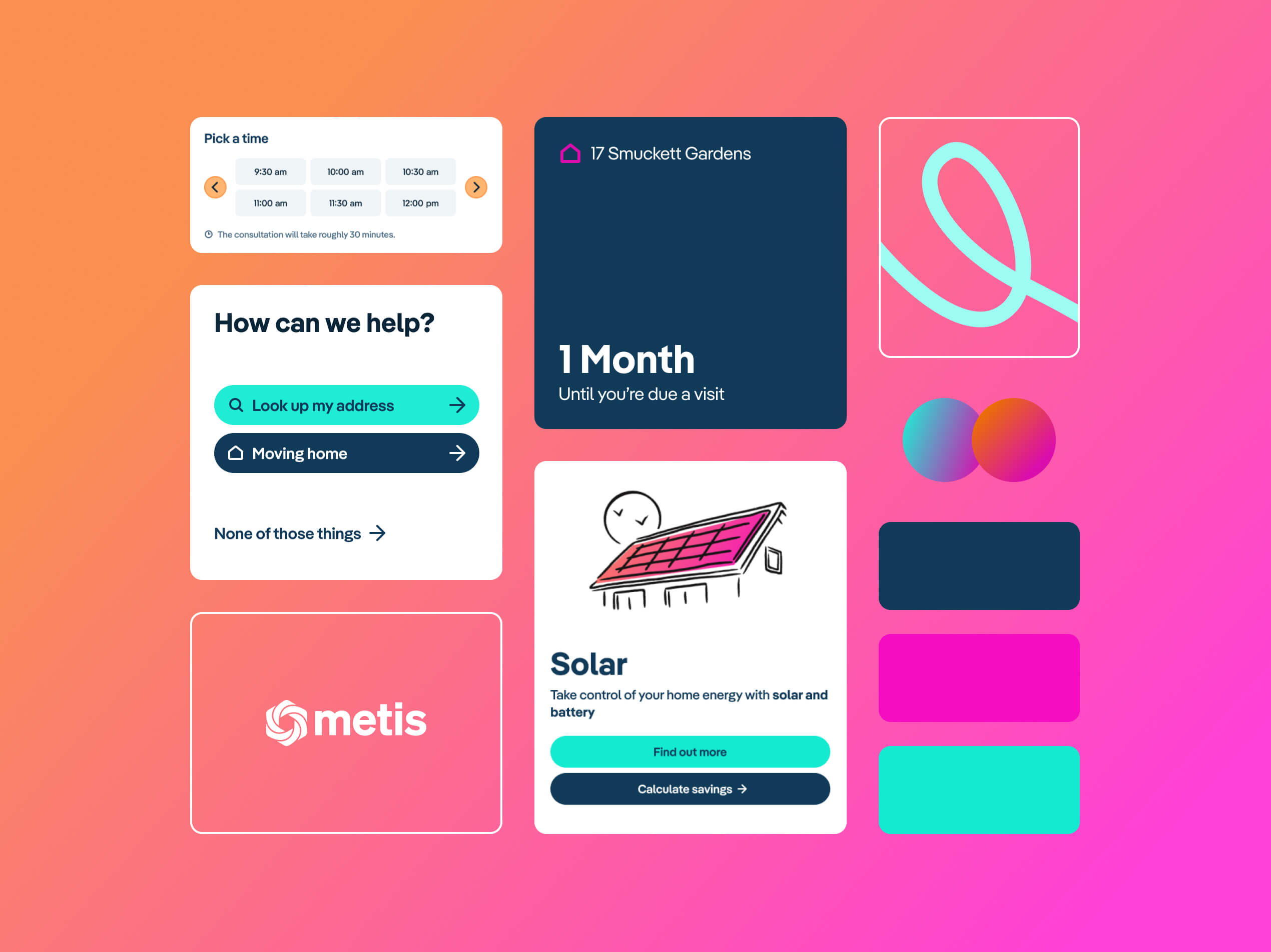
Visual system
The final identity blended both archetypes into a coherent system:
-
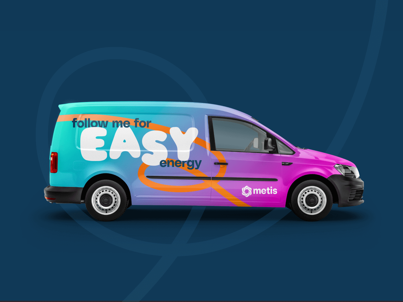
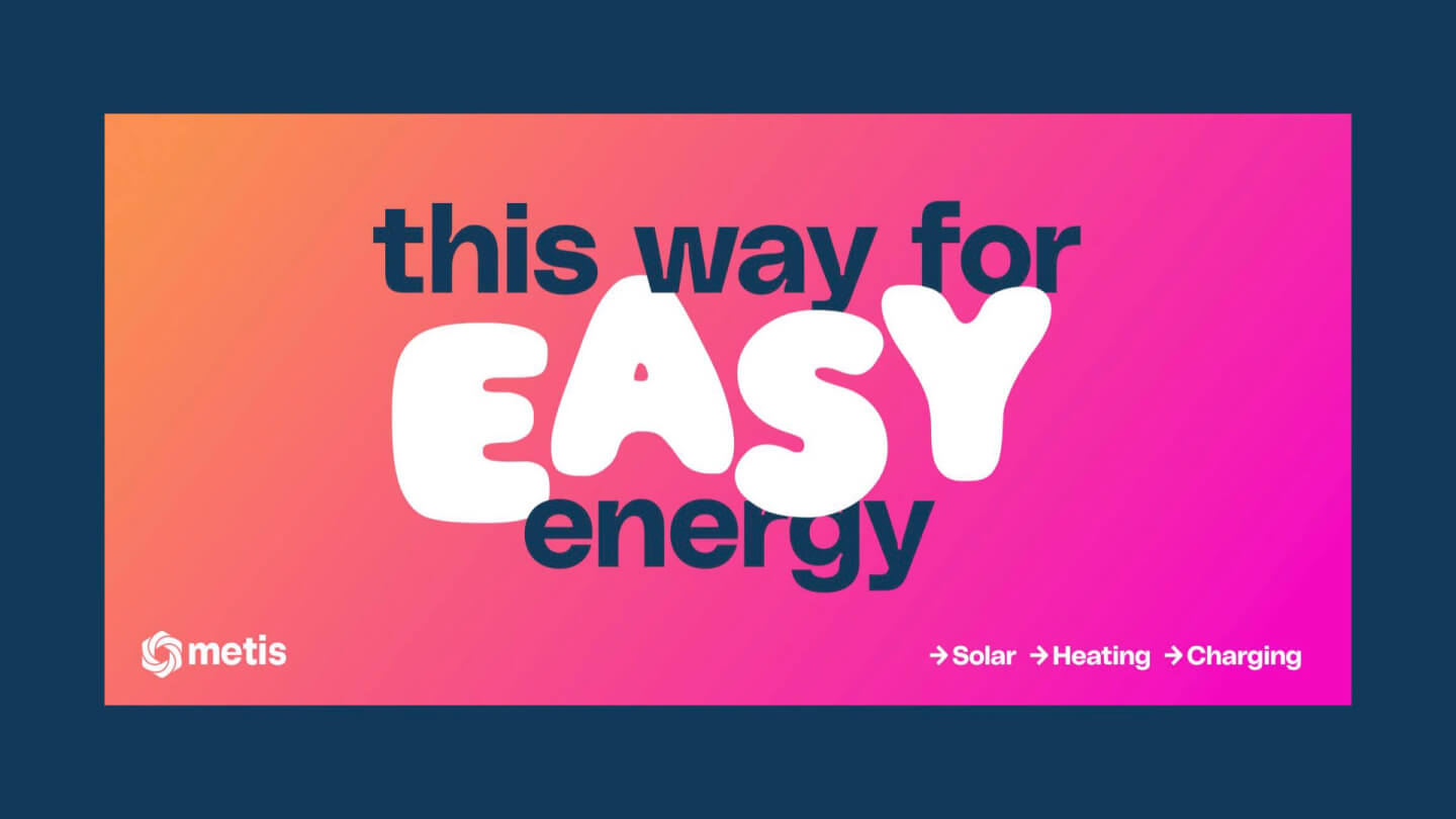
Bold gradient palette to represent energy in motion.
-
“Blimp” typeface for warmth and human touch.
-
Signature flowing line symbolising connection—between people, homes, and the broader energy ecosystem.
-
Custom illustrations by Nick Toye, enriched with subtle gradient animations to make energy feel alive.
Design System
I built a scalable modular system with design tokens and accessibility standards. Every colour combination was tested for clarity and contrast, ensuring inclusivity across web, product, and motion.
Route 1
|
The sage
Route 2
|
The magician


04
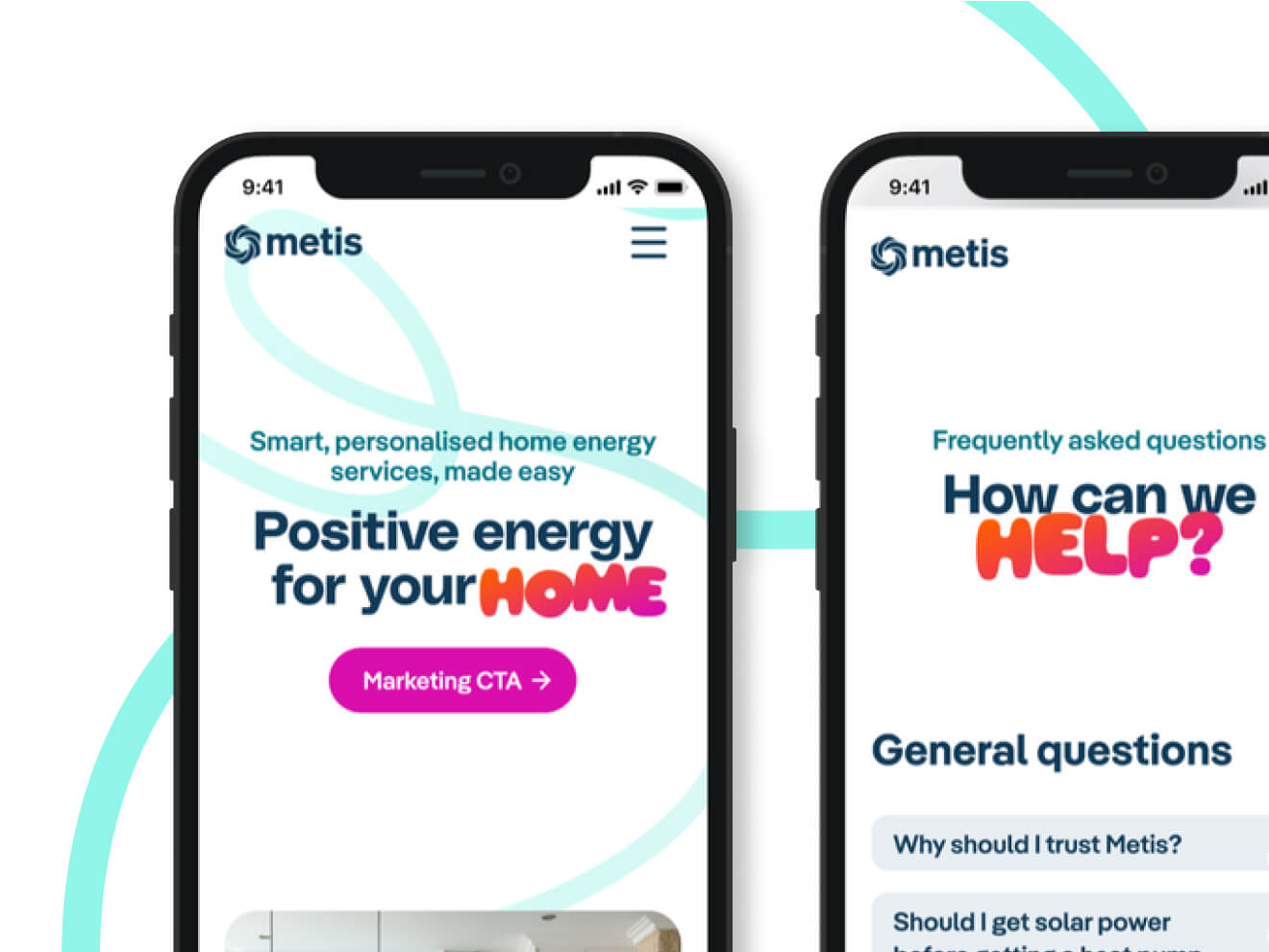
Product Design & Implementation: Designing for Conversion
Awareness
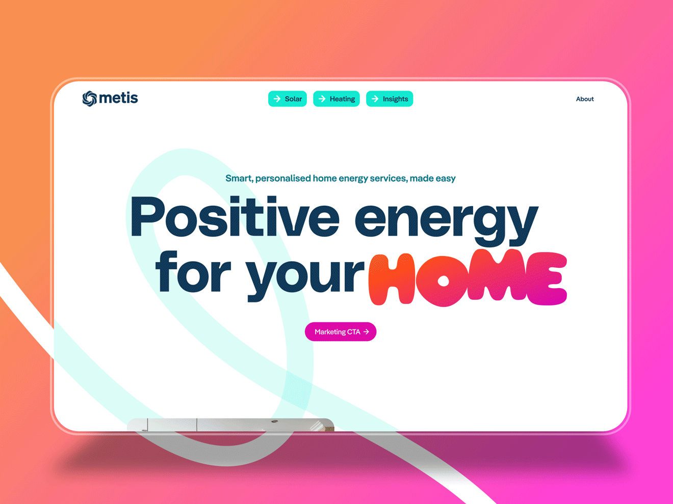
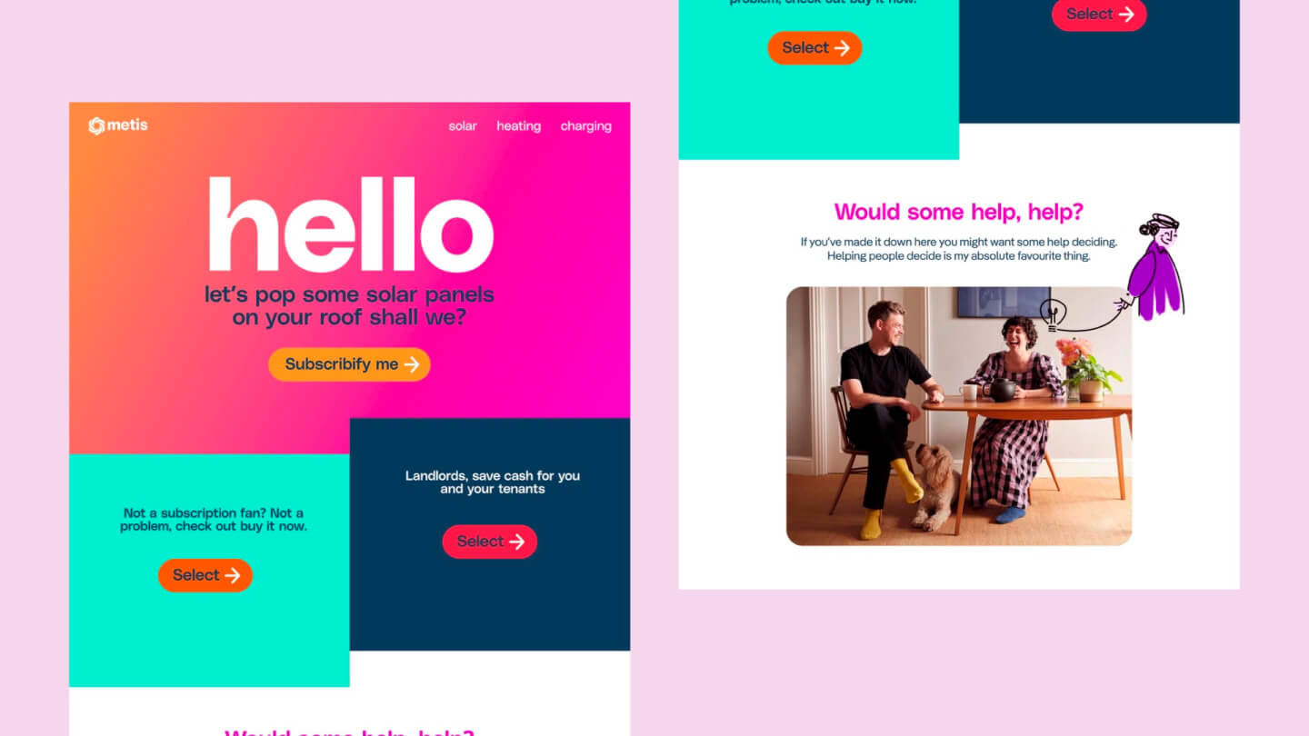
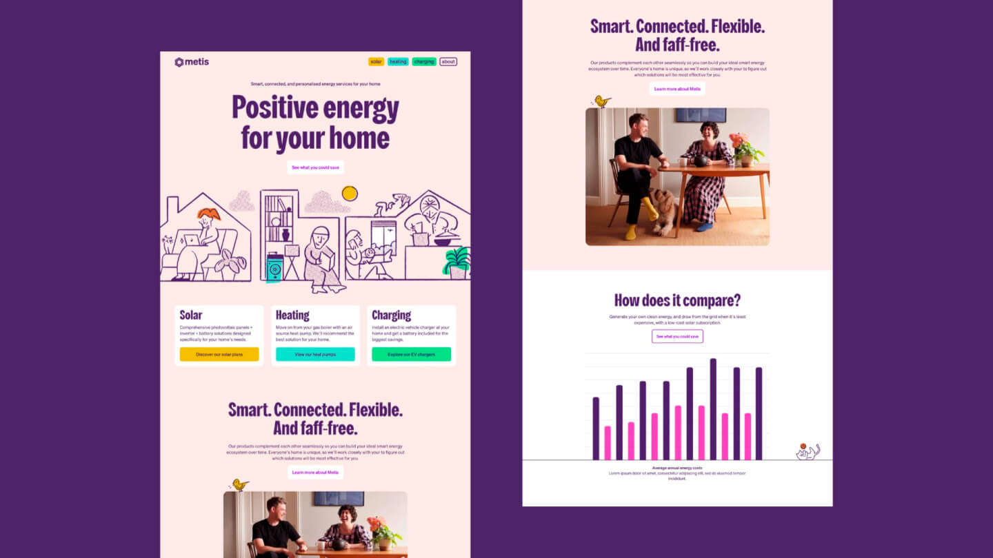
Website Experience
The Metis website was designed as the brand’s primary digital touchpoint—introducing the service, building trust, and guiding users toward the savings journey.
-
Clear information hierarchy explained the energy-as-a-service model in plain language.
-
Accessible UI patterns ensured the experience was inclusive for all users.
-
Visual storytelling integrated gradients, illustrations, and motion to make renewable energy feel human and alive.
-
Mobile-first design optimised the experience for users researching on-the-go.
The website wasn’t just a marketing layer; it was a conversion-focused platform that connected brand storytelling with product functionality.
Conversion
Savings Calculator
The central product feature was a six-step guided flow that translated complex energy data into simple, personalised results.
Key principles
-
Progressive disclosure — breaking down questions step by step to reduce cognitive load.
-
Optional inputs — letting users stay in control of the depth of information.
-
No email gate — results were visible immediately, building trust through transparency.
-
Real-time results — tailored savings estimates tested for clarity and persuasiveness.
Prototyping & validation
We iterated extensively, running usability sessions to ensure the flow was intuitive and the results compelling enough to drive conversions.


05
Impact & Outcomes: Turning Insight into Action
User Impact
Metis reframed renewable energy as simple, transparent, and empowering. Users felt in control of their choices and could clearly see the benefits of switching.
Business outcomes
-
28% reduction in homepage bounce rate — the new brand and digital experience captured attention more effectively.
-
74% completion rate of the savings journey — the calculator proved intuitive and persuasive, turning complexity into action.
-
60% lead engagement rate — a substantial increase in qualified prospects engaging with the platform.
Long-term Value
More than a rebrand, Metis gained a robust digital ecosystem designed for growth—built on clarity, empathy, and transformation.
Credits
| Client | Metis (SMS Energy) |
|---|---|
| Agency | CI&T |
| Brand Lead | Pete Sampson |
| Product Design Lead + Brand Support | Matteo Miele |
| Illustration and UI Support | Nick Toye |