An interactive timeline dedicated to the history of silk
Creative micro-site designed for an SEO campaign. Fully crawlable, mobile-first and brought to life with smooth, scroll-based GSAP animation.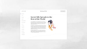
This interactive storytelling case study for Jigsaw explores how scroll-based UX, motion, and editorial design created a fashion experience with depth.
Jigsaw has always had a strong presence at the top and bottom of the funnel — attracting attention and driving conversions with ease. But they felt something was missing in the middle: a way to deepen connection, spark curiosity, and invite people to explore their world more intimately.
Silk — one of their most iconic materials — became the perfect subject for a branded digital storytelling experience. Rather than pushing a product, they wanted to offer something more generous: an SEO-optimised landing page that explored the history of silk, blending editorial content with visual poetry.
That’s when they brought us in. I led the design process, shaping a solution that would strike a balance between performance and beauty. Early on, I identified motion and interactivity as key elements — not just for engagement, but to elevate the brand voice in a space often dominated by static content. The result was a lightweight, SEO-optimised landing page that married clarity with craft — blending UX performance, brand storytelling, and search visibility.
Before diving into visuals, I focused on shaping the narrative structure. I led the early research phase by exploring editorial patterns and how users engage with long-form interactive content. The key insight? Chronology makes history intuitive — but only when the experience flows with clarity and rhythm.
That led to the concept of a scroll-based UX timeline — a structured user flow where each chapter of silk’s story would unfold progressively. I designed the full UX architecture around this idea, mapping out content hierarchy, wireframes, and interface logic to keep the experience seamless. Every UI element was carefully placed to guide attention, support comprehension, and ensure a smooth interaction design.
Motion played a quiet but essential role in the interaction design. Subtle animations helped reinforce pacing and give the story a tactile feel. I kept the interface minimal and focused, letting content and visuals speak for themselves.
I also led the visual direction, commissioning a watercolour illustrator whose work brought warmth and materiality to the timeline. Once the assets were delivered, I handled post-production and animated the transitions to mimic pigment spreading on paper — soft, fluid, and expressive, echoing the nature of silk itself.
Working alongside our in-house copywriter, we refined the narrative voice to match Jigsaw’s tone: editorial yet accessible, polished but never dry. The result was a story that felt crafted — in words, visuals, and flow.
The final build delivered a seamless blend of UX design, interactive storytelling, and SEO-friendly content. Designed as a scroll-based user experience, the page guided users through the history of silk in a way that felt both editorial and immersive.
Behind the simplicity was a carefully engineered structure: clean code, semantic HTML, lightweight animations, and a fully responsive web design — all optimised for both user engagement and organic search performance.
The design worked across multiple layers:
- Scroll-Based UX Design
The timeline format created a clear user flow, helping visitors move effortlessly from one historical moment to the next. No menus, no confusion — just a guided journey from beginning to end. - Motion Design & Microinteractions
Scroll-based animations were calibrated for rhythm, giving each section a sense of presence without slowing down the experience. Microinteractions reinforced transitions and added a sense of control. - Unified Visual & Content System
Typography, layout, and illustration were treated as one system — deliberately minimal, always expressive, always aligned with Jigsaw’s tone. - SEO-Conscious Structure
Content was semantically structured and fully crawlable, ensuring visibility without compromising design. Lightweight code, progressive loading, and accessible markup supported both speed and discoverability. - Responsive, Mobile-First UX
The scroll-based format felt effortless on mobile, adapting cleanly to smaller screens and aligning with natural user behaviour. No taps, no waiting — just a beautifully responsive experience.


Credits
| Client | Jigsaw – Fashion & Lifestyle Brand (UK) |
|---|---|
| Agency | Passion Digital |
| Lead UX/UI Design | Matteo Miele |
| Motion Design | Matteo Miele |
| Illustration | Aaron Jacob Jones |
| Copywriting | Lola Michels |