A new bright platform for the Kingston charity NHS branch
Crafting a welcoming experience that reframed donation as a joyful, impactful act though using a vibrant palette and emotionally clear messaging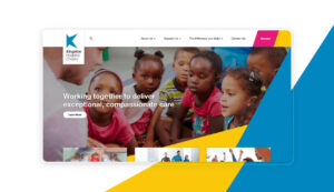

The NHS needed a digital hub to connect with the donors for the Kingston branch. When we first met with the clients, they expressed how important it was to make sure people felt like they were making a positive change. They urged for a digitalisation to allow a smooth experience to their users and to more effectively raise funds, events and recruit volunteers for the charity.
The insight was powerful: when people donate to a noble cause, they’re often confronted with overwhelmingly sad imagery — videos, photos, and words that, while sincere, can leave them feeling powerless. But that’s not the reality. Donations do have impact; they do save lives. My goal as lead UI designer was to translate that truth into a fresh charity website design and user experience that felt empowering, optimistic, and clearly communicated the real-world impact of each donation.
There’s nothing more powerful in communication than showing the positive outcomes of someone’s actions — so the design had to reflect that. The UI design needed to be bright, uplifting, and even playful — helping donors feel not only involved, but inspired to take action. This approach was central to the overall donor engagement strategy.


To kick off the project, I visited the client’s office for a collaborative workshop where we mapped out the user journey, analysed existing data, and identified key pain points and opportunities. On the branding side, I was provided with the Kingston Hospital guidelines — a minimal set that included only the logo and a handful of colour variations. With so few constraints, I saw an opportunity to build something unique from the ground up.
I took the “K” from the logo and broke it down into abstract polygonal shapes, which I then reimagined as dynamic brand elements woven throughout the interface of the nonprofit fundraising platform. This approach didn’t just extend the brand — it gave it new life. The polygons added movement, playfulness, and visual cohesion to the experience, echoing the core message of the platform: that every individual contribution is part of something bigger. It became a signature design choice — subtle yet powerful — that tied the whole experience together.
This design approach gave us a high level of flexibility with shapes and colours, allowing for visual consistency without becoming repetitive. To further elevate the experience, I introduced subtle motion animations to key components — not just for aesthetics, but to reinforce the hierarchy of information and guide user behaviour.
These UX micro-interactions played a strategic role: they highlighted primary actions, reduced cognitive load, and created a seamless, accessible user journey for charity platforms, helping users stay focused and engaged from start to finish.


Credits
| Client | NHS (National Health Service) ─ Kingston Charity Branch (UK) |
|---|---|
| Agency | Passion Digital |
| UX Lead | William Chaumeton |
| UI Lead | Matteo Miele (Studio Miele) |